

Goals and information-based decisions define the growth of any business. Without setting ambitious, actionable plans, the never improving company will eventually grind to a halt. All data is important, but not all data is relevant to making clever decisions that will increase sales, which is why managers need a sales dashboard to visualize actionable data, analyze performance and data driven decisions, and get a comprehensive overview of data from different sources.
Making plans for future development and improvement is crucial, and goals act like a roadmap: the company is here now and aims to get there. Still, the whole sales cycle and planning process is challenging, requires tracking of many details, and decision-making must be based on something other than intuition.
Sales goals are challenging to achieve, but businesses that know exactly where they are at the given moment and where they aim to get in a certain period of time are closer to achieving their ultimate goal. When filled with relevant data and used correctly, sales dashboards give real-time, accessible data for analyzing performance that enables managers to adjust strategies and direct the team to do their best work.
Simply put, a sales performance dashboard is like a goal GPS for sales managers that contains data represented across essential sales metrics to monitor sales strategy through the sales process. Additionally, sales dashboards include key performance indicators to keep a check on performance and revenue growth and discover sales opportunities.
Table of Contents
What Is Sales Dashboard?
A sales dashboard is a potent tool that enables C-level executives, sales managers, and sales leaders to efficiently and effectively control sales KPIs in one central place and monitor sales performance in terms of achieving sales targets.
The sales dashboard helps sales teams to reach sales goals and discover sales opportunities through detailed analysis of sales performance, funnel analysis, sales metrics, and sales cycle. Additionally, the sales funnel and performance dashboard measures sales growth with the help of sophisticated sales dashboard software.
The Sales department must have strong ownership of the sales pipeline, data, key sales metrics, and access to accurate information at any given moment. With sales dashboards, sales reps keep an eye on the team’s performance, sales opportunities, closing deals, lost deals, and all relevant key performance indicators on a daily and strategic level.
With the help of a sales dashboard, the sales team effortlessly navigates through sales tasks while increasing revenue and profits, forecasting events that might impact the goals, and at the same time, comparing data swiftly and accurately.
Dashboards provide a visual representation of the most recent and detailed information and offer a complete 360° overview of sales performance and essential metrics. The concise view of result-based data envisions the sales target and provides full control while empowering sales executives to use the professional sales dashboard software to achieve ambitious growth goals.
Why Sales Teams Should Use Dashboards
Sales teams operate in a fast-paced, target-oriented environment, meaning they need a comprehensive and real-time view of their performance. This entails the need for a visual representation of key sales metrics and data points from various data sources.
The dashboard provides an at-a-glance view of the sales performance, both individual and sales team performance, which enables sales management to adjust, improve or change sales strategies on a daily basis.
The easy-to-read graphical representation of actionable sales data and data is intended to enable sales managers and sales leaders to make decisions based on real-time statistics and not only on periodic reporting data. The gold standards of sales dashboards provide real-time data that can be analyzed through key sales metrics and an up-to-the-moment view of the sales organization’s health.
By implementing a functional dashboard design, the data is presented in a visually captivating way through graphs, pie charts, or bar charts. The visual nature of the sales dashboard enables users to quickly locate problems and issues within the organization and glean actionable insights to find solutions faster.
However, sales performance dashboards are more than monitoring tools. They provide valuable insights to guide strategic financial decisions and provide fact-checking of predictions, assumptions, or even gut feelings. A sales performance dashboard is the unified place for sales representatives to review performance, make sales forecasts, build sales strategy and drive sales growth. Great performance dashboards are comprehensive and transparent and provide high-level and granular details about sales processes.
Instead of manual analysis performed by multiple sales teams and risking accuracy due to human error or mishandling, sales dashboards do the heavy lifting by automatically updating data and making calculations. In other words, the business will save time and funds on collecting and organizing data, and there will be fewer manual errors.
How to Create Sales Dashboard
All dashboards are built on the principle of pulling data into a platform and providing the sales representative with a visual representation of the data. The checklist for creating a sales KPI dashboard includes the following:
- Identify Sales Metrics and Sales KPIs to Track and Monitor
- Identify Where the Data Is Currently Stored (CRM, Excel, Google Sheets)
- Determine How the Team Will Use the Dashboard
- Choose a Sales Dashboard Software
- Pull Data From the Data Service Into the Dashboard
- Choose an Appropriate Visual Representation
- Build Reports for the Sales Dashboard
Identify Sales Metrics and Sales KPIs to Track and Monitor
The first step toward creating a sales reporting dashboard is examining the sales targets of the organization. A sales cycle dashboard will help to visualize the progress of sales process toward the end goal, and selecting the specific sales metrics will help track the advancement of sales process.
In the process of selecting and identifying key metrics necessary for the business, it is helpful to ask several questions:
- What metrics are regularly reviewed in the organization, in meetings, and among the sales team?
- Which metrics are essential and absolutely necessary? Are there some metrics that are less important than others?
- What are the key performance indicators (KPIs)?
- Are there multiple sales teams within the company?
Generally speaking, companies opt for the following categories of metrics:
- Activity sales metrics
- Pipeline sales metrics
- Lead generation sales metrics
- Sales outreach metrics
- Primary conversion sales metrics
- Channel sales metrics
- Sales productivity metrics
- Rep hiring and onboarding metrics
- Sales process, tool, and training adoption metrics
Identify Where the Data Is Currently Stored (CRM, Excel, Google Sheets)
CRM (Customer relationship management) technology is a tool for managing relations within the company and interactions with customers and potential customers. It offers information about store customers and prospect contact, helps identify sales opportunities, manages marketing campaigns, and more to stay connected to customers and improve profitability. Additionally, spreadsheets enable users to input, modify and calculate basically anything and store it digitally for re-use. Anything and everything can be stored on the spreadsheet: from grocery store lists to financial models with massive data sets – the possibilities seem endless.
By using CRM and spreadsheets, organizations can build apps, and in the specific case with internet-connected spreadsheets (such as Google Sheets), users can format and analyze data with different tools but also pull in data from the web and run complex workflows automatically.
Such workflow is a great sales dashboard part, and it is crucial to identify where the relevant data is currently stored to create the sales dashboard templates.
Determine How the Team Will Use the Dashboard
There isn’t a sales dashboard that fits all types of businesses, which is why it is crucial to determine how the team will use the dashboard. For example, the sales rep dashboard can be used to help the individual sales representative to track their progress, but it also can be used to see the top-performing sales reps for the quarter.
Some of the aspects to consider are:
- Who will use the dashboard: sales reps, sales management, sales executives, or VPs?
- How will they use it: daily, weekly, monthly, or quarterly?
- What information is relevant for them: which metrics, visualizations, and calculations do they need to analyze and monitor?
Another important aspect is to consider the dynamic of the team who will view the dashboard. For example, if the sales team works outside and is constantly on the go, a mobile-friendly version of the dashboard will come in handy; otherwise, if the team is working from the office or home, making a tv and computer-friendly dashboard is practical.
Choose a Sales Dashboard Software
After understanding the needs and defining how the dashboard will be used, who will use it, and how, choosing a sales dashboard provider that meets those requirements is vital.
For example, if the organization uses a relationship management system or CRM, it would be best to ask the sales manager or technical team if there is a feature to create a dashboard. However, even if the company is not using a CRM, there are many stand-alone reporting tools, both free and paid, for syncing or importing data to create your own sales dashboards and reports. Our sales dashboard software providers’ suggestions are Redfield, HubSpot, Datapad, Klipfolio, and Databox.
Pull Data From the Data Service Into the Dashboard
The benefit of using a dashboard that integrates with the company’s other CRM data, is the easy sync of the data between them. For example, some software allows users to generate reports based on data from the customer database. Additionally, users can create dashboards to track sales performance, identify top-performing sales reps, create sales forecasts, and more.
Redfield has broad experience in creating easy-to-interpret dashboards for various goals and offers a variety of dashboards, such as enterprise dashboards, that help businesses to save time and human resources on creating, managing, and sharing reports, consolidating information across your company and developing cross-functional communication between all levels of business.
Additionally, with Interactive dashboards that are produced and updated automatically, businesses can effortlessly detect weak points and areas of growth for the company instead of focusing on bigger strategic goals and increasing total revenue.
Choose an Appropriate Visual Representation
Data visualizations are a vital component of dashboards as they can summarize large amounts of data and effectively present it in a graphical format. Many chart types are available, each with its strengths and use cases. Different visual representation is needed depending on whether the company aims to analyze change over time, look at how data is distributed, compare values between groups, or observe relationships between variables.
Choosing the right way to represent sales data is the trickiest part. For example, bar charts are the best choice to compare sales for different periods, while line charts are the best option for showing trends over time.
The most common types of charts are:
- Bar chart (column chart) – encodes value by the heights of bars from a baseline
- Line chart – encodes value by the vertical position of points connected by a line segment
- Pie chart – represents the whole as a circle divided by slices into parts; presents percentage and color-segments
- Box plot – helpful chart when the distribution of values needs to be plotted for each period or between different groups
- Scatter plots – an essential type of data visualization that shows relationships between variables
Build Reports for the Sales Dashboard
In the process of building reports, managers can pick from a wide range of examples and templates of charts to visualize the data. Depending on the company’s needs, some examples and templates of the most valuable chars are:
- Comparing values – e.g., used to compare sales from two different territories
- Composition – e.g., total sales run down by sales rep
- Trends – e.g., month-over-month revenue growth
It is important to remember that the best visualizations are easy to read and interpret. The ultimate goal is to utilize the dashboard for actions, so all users should be able to read and understand the charts at a glance without the need to click on the full report.
Sales Dashboard Tips
In addition to creating a visually attractive dashboard, it is also essential to follow several tips when creating the sales dashboard:
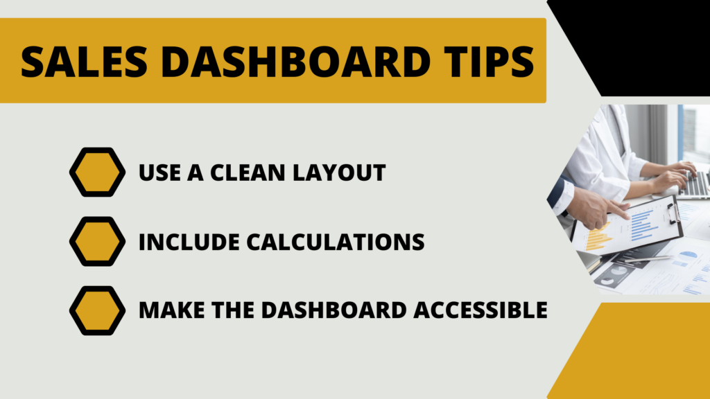
Use a clean layout
Avoid using too many colors for the visuals (graphs and charts), and don’t make them too busy. The point is for the user to ‘read’ the dashboard at a glance, and an overcrowded dashboard will distract them from the data. For example, many dashboard tools allow applying the reports into a grid to make the dashboard even more organized.
Research by The Nielsen Norman Group showed that people tend to view the left side of a webpage, and having that in mind, it would be pragmatic to place the critical visuals on the left-hand side of the dashboard.
Include Calculations
When applicable, it would be constructive to include calculations to add context to a report and save time. Doing mental math for revenue growth during a meeting will distract the team from the initial purpose of the meeting.
Make the Dashboard Accessible
Dashboards are meant explicitly for the leadership: sales managers, VPs, and executives, but making them available to all employees can significantly improve overall performance. Transparency is one way to motivate sales teams and individual contributors to see their numbers’ impact on the business.
Sales Dashboard Examples
There aren’t a universal sales dashboard examples that all sales organizations can use. Below is an overview of the top 3 sales dashboard examples covering an organization’s most important sales aspects.
Sales Performance Dashboard
The sales dashboard provides an overview of the progress of the sales department and is excellent for monitoring sales growth, sales targets, ARPU (Average Revenue Per User), CAC (Customer Acquisition Cost), and CLV (Customer Lifetime Value). Combining every aspect of the sales portfolio in a visual board enables a unique opportunity to analyze the full picture of the sales operations swiftly and effortlessly.
Sales managers need instant insight into the most critical metrics and developments. The information for individual sales reps and targets from the sales rep and performance dashboard shows whether the team is meeting the individual sales reps’ goals and whether members of the team need additional training, which helps the planning process for company goals and helps in the creation of polished sales reports.
Additionally, real-time sales monitoring can benefit operational management by improving profit margins. By monitoring the critical KPIs, sales managers get a comprehensive sales performance that can enhance the department’s performance and increase the sales team’s full cycle efficiency. This interactive dashboard enables users to quickly, easily, and efficiently track and monitor changes, compare virtual numbers, and identify spots requiring strategic changes.
Sales KPI Dashboard
The sales KPI dashboard is specifically crafted for C-level executives, managers, and sales VPs and contains high-level sales metrics. The KPI dashboard in sales presents the most critical strategic and operational data crucial for running the department successfully while increasing the quality and performance of the sales organization.
The dashboard presents some critical sales numbers as an at-a-glance overview, including information about revenue, profit, and costs. By setting targets and enabling comparisons to the previous period, managers and executives get a detailed view of the direction in which the department is moving, a perspective of how close (or far) they are in reaching the goals, and get information on whether they need to change or adjust the strategy.
Increased income and profit for the business are the bottom lines of every sales strategy development. To achieve the ultimate goal, the sales managers need to focus on high-level KPIs and thus enable managers to implement the strategies at the most transparent and accurate level possible. The possibility to track sales statistics and performance in real-time promotes an overview of the entire department and promptly spots anomalies in the strategy in a visual manner.
Sales Analysis Dashboard
The previous examples of sales dashboards had a B2B focus, and the analysis sales dashboard example is a high-end sales analytics dashboard with a B2C focus. The sales analysis dashboard covers the key product and region metrics that sales departments need to monitor to optimize strategies and ensure steady sales growth. The most significant advantage of this type of dashboard is that users can easily explore data by selecting filters such as product category, specific product, sales representative, region, country, and observed period. This option enables managers to answer any questions that may arise and deeply analyze the data collected in one dashboard.
The three relevant performance metrics included in this dashboard are total revenue, total profit, and average profit margin, all of which can be further analyzed through a detailed graph that compares the performance of important metrics for different quarters and enables users to locate the issues and find the reasons that had led to that.
For example, managers can by data point discover that a specific country has the highest sales volume but lower revenue than a country with fewer sales but higher revenue. This might be due to high operational costs that need to be tracked to ensure maximum profitability. Another example is to analyze the top 10 products by revenue, identify the products that are not performing as expected, and implement strategic measures for improvement.
To Sum Up
Organizations increasingly rely on metrics and data to make business decisions, create informed strategies and set objectives. Managing the sales team without robust data is a mission that cannot be completed, so accordingly, sales data is vital for sales specialists at all levels to analyze performance and make key decisions for reaching the ultimate goals.
Sales dashboards are the visual tool for monitoring and guiding the sales team to success and toward the set target. Unlike Excel spreadsheets, which require much effort to function fully, sales dashboards are practical visualization tools that present information from various sources and formats and automatically update the new information daily.
FAQs
What Is A Sales Dashboard?
A sales dashboard is a potent tool that enables C-level executives, sales managers, and sales leaders to efficiently and effectively control sales KPIs in one central place and monitor sales performance in terms of achieving sales targets.
How To Create A Sales Dashboard?
The checklist for creating a sales KPI dashboard includes:
– Identify Sales Metrics and Sales KPIs to Track and Monitor
– Identify Where the Data Is Currently Stored (CRM, Excel, Google Sheets)
– Determine How the Team Will Use the Dashboard
– Choose a Sales Dashboard Software
– Pull Data From the Data Service Into the Dashboard
– Choose an Appropriate Visual Representation
– Build Reports for the Sales Dashboard
What Is The Best Sales Dashboard?
The top 3 sales dashboards are: Sales performance dashboard, Sales KPI dashboard, Sales analysis dashboard.